
Contrast Ratios: Why They Actually Matter
Learn how WCAG standards ensure your designs are readable for everyone. We break down the math and show you practical tools to check your work.
Read ArticleLearn contrast ratios, theme toggles, and icon adaptation techniques that work in Malaysia and beyond. Build interfaces your users actually prefer.

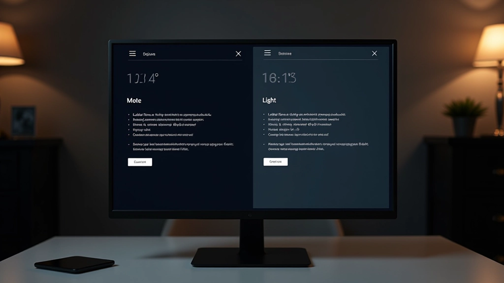
Users don’t all see the same way. Creating interfaces that work beautifully in both dark and light modes isn’t optional anymore—it’s expected.
The shift toward dark mode adoption has been dramatic. We’ve gone from a niche preference to mainstream expectation. But here’s the thing: you can’t just invert colors and call it done. Real dark mode design requires understanding contrast ratios, color psychology, and how human eyes perceive light differently in various environments.
Whether someone’s working late at night, sitting in bright sunlight, or using their phone in a dimly lit room, your interface should adapt. That’s where theme toggles come in. But designing an effective toggle? That’s its own skill.
Add icon adaptation to the mix—because icons that look sharp on light backgrounds can become muddy on dark ones—and suddenly you’re managing multiple design systems simultaneously. It’s complex. But we’re going to break it down into manageable pieces.
Get answers to what designers ask us most
A contrast ratio measures the difference in brightness between two colors. WCAG standards require 4.5:1 for normal text and 3:1 for large text to ensure readability for everyone, including people with low vision. We’ll show you the tools to check yours.
No—and if you try, users will notice immediately. Dark mode isn’t simply “invert everything.” Colors behave differently in dark environments. Bright white (#ffffff) becomes harsh and strains eyes. You’ll need to adjust saturation, brightness, and sometimes pick entirely different colors.
Icons need consistent stroke weight and visual weight across themes. Thin lines that work fine on light backgrounds can disappear on dark ones. We cover stroke adjustment, weight balance, and the specific techniques that keep icons crisp and recognizable everywhere.
It depends on your users and context. High-discoverability locations (header, quick settings) work best when users frequently toggle. We’ll walk through different placement strategies and what data shows actually gets used.
Modern best practice: respect system preference first, but let users override it. Use prefers-color-scheme media query to detect OS setting, then provide a toggle to change it. Store user preference in localStorage so it persists across sessions.
Both. Dark mode reduces eye strain in low-light environments and can extend battery life on OLED screens. But users also just prefer it. Some studies show it improves focus. The real benefit? Giving users choice increases satisfaction and accessibility.
A structured approach to building dual-theme systems that actually work
Start by mapping your base colors, then create deliberate adjustments for dark mode. Don’t just flip a switch—think about saturation, brightness, and how colors interact at different contrast levels. This is where most designers go wrong.
Use contrast ratio checkers to verify every text-background combination meets 4.5:1 for normal text. Test on actual devices, not just your design tool. Different screens render colors differently, and that matters.
Go through every icon and adjust stroke weight, spacing, or style for the dark theme. Some icons might need weight adjustments; others might need slight redesign. This takes time but prevents that “off” feeling users notice.
Create a clear, discoverable toggle control. Make it visually obvious what theme you’re switching to. Test placement with real users—some prefer it in the header, others in settings. Your data will tell you what works.
Use CSS custom properties to manage your color system. A single media query or class change can switch your entire theme. This makes maintenance easier and prevents color inconsistencies across your interface.
Don’t just test in your design tool or perfectly lit office. Check how it looks on phones at night, on laptops in sunlight, on different screen types. Real conditions reveal problems that mockups hide.
Comprehensive guides covering every aspect of dark and light mode design
How colors behave differently in dark environments. Why pure white backgrounds fail in dark mode. The science of readability and eye strain.
WCAG standards explained. Tools for measuring contrast. How to audit your designs. What 4.5:1 actually means and why it matters.
Making icons look crisp in both themes. Stroke weight adjustments. Style variations. Building icon systems that scale across themes.
Placement strategies. Visual design of toggle controls. UX best practices. How to store user preferences. System preference detection.
CSS custom properties for theme management. JavaScript for toggle functionality. Respecting prefers-color-scheme. Working code examples you can use.
Dark mode on mobile devices. Touch-friendly toggles. Keyboard navigation. Screen reader compatibility. Testing across devices.
Detailed guides that go beyond the basics
Learn how WCAG standards ensure your designs are readable for everyone. We break down the math and show you practical tools to check your work.
Read Article
The toggle is often overlooked, but it’s crucial for user experience. We’ll cover placement, design, and implementation patterns that actually work.
Read Article
Icons are trickier than you’d think. Discover how to adjust stroke weight, manage visual weight, and keep icons crisp across both themes.
Read ArticleReal feedback from people who’ve implemented these techniques
“I wasn’t confident about implementing dark mode until I understood contrast ratios properly. The guides here made it click for me—now I can’t imagine not testing both themes from the start.”
“The icon adaptation section saved me hours. I’d been guessing at stroke weights and it never felt quite right. Having the actual process written out—that’s what made the difference.”
“We’re redesigning our entire platform and dark mode was non-negotiable. This resource covered everything we needed—color systems, accessibility, even the toggle placement strategies we actually tested. Don’t waste time figuring it out yourself.”
Stop guessing about contrast ratios and color choices. Learn the principles, see the code, and implement dual-theme design that your users will actually appreciate.
Start Learning Now